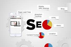
Mobile Search Engine Optimisation: A Practical Guide to Better Rankings and User Experience

Mobile Search Engine Optimisation: A Practical Guide

Mobile search engine optimisation (SEO) is the process of making a website easy to find, use and understand on smartphones and tablets. It brings together technical SEO, useful content and a smooth mobile experience. As many people search while on the move, a site that works well on smaller screens can help visitors find information, contact a business or complete a purchase.

Why mobile SEO matters

Search engines need to crawl and understand your pages, while visitors need to use them without pinching, zooming or waiting for them to load. A poorly designed mobile site can make it difficult to read content, follow links or complete forms. This may lead people to leave before finding what they need.

Google uses the mobile version of a site for indexing and ranking through mobile-first indexing. This makes it important to ensure that the mobile version contains the same essential content and SEO signals as the desktop version. A mobile-friendly design alone is not enough if key information is missing or difficult for search engines to access.

Use a responsive design

Responsive design allows a website’s layout to adapt to different screen sizes. It is generally the simplest approach to manage because the same page and URL serve desktop, tablet and mobile visitors.

Check that your pages:

  • Fit the screen without horizontal scrolling.
  • Use readable text sizes and clear spacing.
  • Have buttons and links that are easy to tap.
  • Display images and videos correctly on smaller screens.
  • Keep navigation simple and straightforward.

Make sure mobile content is complete

Mobile pages should provide the information visitors need, not a reduced version that omits important details. Keep useful headings, product information, internal links, images and other key content available to mobile users. Search engines may have less context if essential material is hidden or removed from the mobile version.

Use clear headings to organise information, and put the most useful content where visitors can find it easily. Avoid making people work through unnecessary pop-ups or lengthy introductions before they can reach the answer to their search.

Improve page speed and Core Web Vitals

Mobile connections and devices vary, so pages should be built to load efficiently. Compress images, use modern image formats where appropriate, remove unnecessary scripts and limit features that add weight without improving the experience. Caching and a content delivery network may also help, depending on how your site is hosted.

Core Web Vitals are metrics used to assess aspects of page experience:

  • Largest Contentful Paint (LCP): how quickly the main content appears.
  • Interaction to Next Paint (INP): how quickly a page responds to user interactions.
  • Cumulative Layout Shift (CLS): how much the page layout moves unexpectedly.

Use tools such as Google Search Console and PageSpeed Insights to identify issues. Field data reflects real user experiences, while laboratory tests can help diagnose specific problems. Treat these metrics as part of a wider effort to make pages faster and easier to use, rather than as a substitute for useful content.

Optimise the mobile user experience

Good mobile SEO depends on more than technical settings. Consider how people use your site on a small screen. Make important actions—such as calling, booking or buying—easy to find. Keep forms short, use suitable input types for fields such as email addresses and telephone numbers, and show clear error messages when something goes wrong.

Make sure menus are easy to open and close, links are not crowded together, and interactive elements work with touch as well as a keyboard. Avoid intrusive interstitials that cover the content people have come to see.

Support local mobile searches

Mobile searches often have local intent, such as looking for a nearby service or checking opening times. Businesses with a physical location should keep their name, address and telephone number consistent across their website and relevant online listings. Create useful location pages where appropriate, and keep opening hours and contact details up to date.

Make it easy for visitors to act on local information. A clear telephone link, directions and booking details can help someone move from a search to a visit or enquiry.

Use structured data carefully

Structured data helps search engines interpret information on a page. Depending on your business and content, this might include details about products, articles, events or local businesses. Make sure the markup is accurate and reflects content that is visible to visitors. Structured data can make pages eligible for enhanced search results, but it does not guarantee that those results will appear.

Test your mobile pages regularly

Do not rely on checking a single page on one phone. Test key page types—such as product pages, service pages, articles and contact forms—on different screen sizes. You can use Google Search Console to review indexing and experience reports, and analytics tools to understand how mobile visitors use your site.

Look for practical signs of friction: pages that are slow, forms that are abandoned, buttons that are rarely used or important content that visitors struggle to find. Combine these observations with feedback from real users to decide what to improve.

A mobile SEO checklist

  • Use a responsive design that works across screen sizes.
  • Keep important content and SEO signals consistent between mobile and desktop.
  • Make pages quick to load and stable while they load.
  • Use readable text, clear navigation and accessible tap targets.
  • Make forms and key actions simple to complete.
  • Check local details and structured data for accuracy.
  • Test real page templates and monitor performance over time.

Conclusion

Effective mobile SEO starts with a simple goal: make it easy for people and search engines to access and understand your website on a mobile device. A responsive layout, complete content, fast pages and clear user journeys provide a strong foundation. Regular testing helps you spot problems and improve the experience as your audience and technology change.


Top 5 Tips for Optimising Mobile Search Engine Performance

  1. Use responsive design that adapts to every screen size.
  2. Improve mobile page speed by compressing images.
  3. Make text readable without zooming.
  4. Keep menus and buttons easy to tap.
  5. Check mobile usability in Google Search Console.

Use responsive design that adapts to every screen size.

Use responsive design so your website automatically adjusts to different screen sizes, from smartphones and tablets to desktop monitors. Text, images, menus and page layouts should remain clear and easy to use without horizontal scrolling or excessive zooming. A consistent experience across devices helps visitors find what they need and makes it easier to maintain your site.

Improve mobile page speed by compressing images.

Improve mobile page speed by compressing images before uploading them to your website. Large image files can take longer to load, particularly on slower mobile connections, so resizing images to the dimensions they’ll actually be displayed at and choosing efficient formats such as WebP can reduce file sizes without noticeably affecting quality. Faster-loading pages make it easier for visitors to find what they need and can support a better overall mobile experience.

Make text readable without zooming.

Make sure visitors can read your mobile content without pinching or zooming. Use a comfortably sized font, clear line spacing and strong contrast between text and background, and check that paragraphs fit the screen without horizontal scrolling. Readable text makes your pages easier to use and helps people find the information they need.

Keep menus and buttons easy to tap.

Keep menus and buttons easy to tap on smaller screens by making them large enough to select comfortably and leaving plenty of space between nearby links. Use clear labels and place important actions where visitors can find them without excessive scrolling. This makes your website easier to navigate, reduces accidental taps and helps mobile users complete tasks with less frustration.

Check mobile usability in Google Search Console.

Use Google Search Console to check how well your site works for mobile visitors. Review the available page experience and Core Web Vitals reports, and inspect individual URLs to identify issues that may affect usability or indexing. Fix problems such as slow-loading pages, unstable layouts or content that is difficult to access, then check the affected pages again after making changes. Regular monitoring can help you spot issues early and provide a smoother experience on smartphones and tablets.

mobile seo service

Mobile SEO Service: Improve Your Website’s Performance on Every Device

Mobile SEO Service: Make Your Website Work Better on Every Screen

More people than ever use smartphones to search, browse and shop online. If your website is difficult to use on a mobile device, visitors may leave before they find what they need. A professional mobile SEO service helps improve your website’s performance in mobile search and creates a smoother experience for people using smartphones and tablets.

Mobile SEO is not simply about making a desktop website fit a smaller screen. It involves reviewing how your site loads, appears and functions on mobile devices, then making improvements that help both users and search engines understand and navigate it.

What is mobile SEO?

Mobile SEO is the process of optimising a website for mobile users and mobile search. It covers technical performance, page design, content, navigation and accessibility. The aim is to make it easy for visitors to find information and complete tasks, whether they are reading an article, requesting a quote or making a purchase.

Google primarily uses the mobile version of a website for indexing and ranking. This makes it important for your mobile pages to contain the same essential content and structured data as your desktop pages, while still being quick and comfortable to use on a smaller screen.

What does a mobile SEO service include?

The right service will depend on your website and business goals, but a mobile SEO project may include:

  • Mobile usability checks: Reviewing layouts, text size, buttons, menus and forms on different screen sizes.
  • Page speed improvements: Identifying factors that slow pages down, such as oversized images, unnecessary scripts or inefficient code.
  • Responsive design guidance: Helping ensure pages adapt to different devices without hiding important content or functionality.
  • Technical SEO reviews: Checking mobile crawling, indexing, redirects, canonical tags and structured data.
  • Content optimisation: Making information clear, useful and easy to scan on a phone, with headings and page layouts that support quick reading.
  • Mobile conversion improvements: Finding friction in key actions, such as calling your business, submitting a form or completing a purchase.
  • Performance monitoring: Tracking mobile search visibility, organic traffic and user behaviour over time.

Why mobile SEO matters

It supports a better user experience

Mobile visitors often have limited time and screen space. Small text, awkward navigation, intrusive pop-ups and hard-to-use forms can make a site frustrating. Mobile SEO helps identify and address these issues, making it easier for people to get the information they came for.

It can strengthen your search visibility

Search engines aim to show results that are relevant and useful. A technically sound mobile site helps search engines access and understand your pages. Strong mobile performance alone cannot guarantee higher rankings, but it is an important part of a well-rounded SEO strategy.

It can help turn visits into enquiries and sales

Traffic is only valuable when visitors can take the next step. Clear calls to action, tap-friendly buttons and simple forms can make it easier for mobile users to contact you or buy from you. Even small improvements to the mobile journey can make an important difference to how well a website supports business goals.

Common mobile SEO problems

Some mobile issues are easy to overlook when a website is checked mainly on a desktop computer. Common problems include:

  • Pages that require horizontal scrolling.
  • Text or buttons that are too small to use comfortably.
  • Slow-loading pages, particularly on weaker connections.
  • Important content that is missing or difficult to find on mobile.
  • Pop-ups that cover the main content or are difficult to close.
  • Forms with too many fields or controls that are awkward to use.
  • Images and videos that do not resize properly.
  • Mobile pages affected by broken links, incorrect redirects or blocked resources.

How mobile SEO is measured

A mobile SEO service should be guided by evidence rather than guesswork. Depending on the project, an SEO specialist may use analytics, search performance data, technical crawls and real-device testing to understand how the website performs.

Useful indicators can include mobile organic impressions and clicks, rankings for relevant searches, page loading performance, engagement and completion of important actions. Metrics should be considered in context: a change in traffic or rankings can have several causes, so regular analysis is more useful than relying on a single figure.

Mobile SEO and responsive web design

Responsive design is a popular way to serve the same website across desktop, tablet and mobile screens. The layout adjusts to suit the device, while the page address generally stays the same. This can make a site easier to manage and gives users a consistent experience.

However, responsive design does not automatically make a website mobile-friendly. Pages still need to be tested for usability, speed, content quality and technical accessibility. The structure may adapt perfectly while a form remains difficult to complete or a key page takes too long to load.

Choosing a mobile SEO service

Look for a provider that takes time to understand your website, customers and objectives. A useful service should explain what has been reviewed, prioritise practical improvements and show how progress will be assessed.

Be cautious of promises of guaranteed rankings or instant results. SEO is an ongoing process, and outcomes depend on factors such as competition, the condition of your website and the quality of implementation. A clear action plan and transparent reporting are better signs of a responsible approach.

Make mobile performance part of your SEO strategy

Your mobile website is often the first experience a potential customer has with your business. A dedicated mobile SEO service can help uncover technical and usability issues, improve the experience for visitors and support your wider search strategy.

Whether you run a local business, an online shop or a service-based company, reviewing your website from a mobile user’s perspective is a practical place to start. Identify the pages and actions that matter most, test them on real devices and make improvements based on what the evidence shows.


Top 6 Tips for Choosing an Effective Mobile SEO Service

  1. Choose a service that prioritises mobile-first indexing.
  2. Ensure your website uses responsive design.
  3. Improve mobile page speed and Core Web Vitals.
  4. Make navigation and buttons easy to use on small screens.
  5. Optimise local SEO for mobile searches.
  6. Track mobile rankings, traffic and conversions regularly.

Choose a service that prioritises mobile-first indexing.

Choose a mobile SEO service that prioritises mobile-first indexing, where search engines primarily use the mobile version of your website to understand and rank its content. Your provider should check that mobile pages include the same essential information, structured data and metadata as desktop pages, and that they’re easy to crawl and use. This helps ensure your site presents a consistent, accessible experience for both visitors and search engines.

Ensure your website uses responsive design.

Ensure your website uses responsive design so its layout adapts to different screen sizes, from smartphones and tablets to desktop computers. Text should remain easy to read, images should resize neatly, and menus and buttons should be simple to use without zooming or horizontal scrolling. Test key pages and forms on a range of devices to check that visitors can find information and take action comfortably. Responsive design supports a better mobile experience and makes it easier to manage a consistent website across devices.

Improve mobile page speed and Core Web Vitals.

Improving mobile page speed and Core Web Vitals can make your website quicker and more comfortable to use on smartphones. Start by compressing images, reducing unnecessary scripts and choosing reliable hosting, then check how quickly the main content loads, how stable the layout remains and how soon the page responds to interactions. Regular testing can help identify issues and prioritise fixes, supporting a better experience for visitors and your wider mobile SEO performance.

Make navigation and buttons easy to use on small screens.

Make navigation and buttons easy to use on small screens by keeping menus simple, using clear labels and ensuring links and buttons are large enough to tap comfortably. Leave sufficient space between interactive elements to prevent accidental clicks, and place important actions—such as “Call us” or “Get a quote”—where visitors can find them quickly. A mobile SEO service can identify usability issues like these and help create a smoother experience for smartphone users.

Optimise local SEO for mobile searches.

Optimise local SEO for mobile searches by making it easy for nearby customers to find accurate information about your business. Keep your Google Business Profile up to date with your address, opening hours, phone number and services, and make sure these details match those on your website and other directories. Include relevant location terms naturally in your page titles and content, and ensure your site is quick to load and simple to use on a phone. Clear directions, click-to-call links and genuine customer reviews can also help mobile visitors choose and contact your business.

Track mobile rankings, traffic and conversions regularly.

Track your mobile rankings, organic traffic and conversions regularly to understand whether your mobile SEO efforts are delivering results. Reviewing these metrics over time can reveal which pages are gaining visibility, where visitors may be dropping off and whether mobile users are completing valuable actions, such as making an enquiry or placing an order. Use analytics and search performance tools to spot trends, then refine your strategy based on the findings.

amp seo

Unlocking the Power of AMP for Superior SEO Performance

The Impact of AMP on SEO

The Impact of AMP on SEO

Accelerated Mobile Pages (AMP) is a technology developed by Google to improve the performance of web content on mobile devices. Initially designed for publishers to create fast-loading mobile pages, AMP has now become a crucial factor in search engine optimisation (SEO).

Why AMP Matters for SEO

AMP plays a significant role in enhancing user experience, which is a key ranking factor for search engines like Google. By providing lightning-fast load times and a seamless browsing experience, AMP pages are more likely to rank higher in search results compared to non-AMP pages.

Mobile-friendliness is another critical aspect of SEO, and with the increasing number of users accessing the internet via mobile devices, having an AMP version of your website can give you a competitive edge in search rankings.

Benefits of Implementing AMP for SEO

Improved Page Speed: With AMP, web pages load almost instantly, reducing bounce rates and keeping users engaged with your content.

Higher Visibility: Google often prioritises AMP pages in search results, especially in mobile searches, leading to increased visibility and organic traffic.

Better User Experience: Fast-loading pages provide a better user experience, leading to higher user satisfaction and potentially more conversions.

Challenges of Implementing AMP

While AMP offers numerous benefits for SEO, there are some challenges associated with its implementation. Customising the design and functionality of AMP pages to match your brand identity can be complex. Additionally, maintaining separate versions of your website (AMP and non-AMP) may require additional resources and technical expertise.

Conclusion

In conclusion, implementing Accelerated Mobile Pages (AMP) can have a significant impact on your website’s SEO performance. By prioritising speed and user experience, you can improve your search rankings and attract more organic traffic from mobile users. While there are challenges involved in implementing AMP, the long-term benefits for your SEO strategy make it a worthwhile investment.


7 Essential Tips for Enhancing Your AMP SEO Strategy

  1. Ensure your website is mobile-friendly for better AMP SEO.
  2. Optimize your content for fast loading speed on AMP pages.
  3. Use structured data markup to help search engines understand your AMP content better.
  4. Focus on creating high-quality and relevant content for improved AMP SEO.
  5. Regularly monitor and analyze your AMP performance to make necessary improvements.
  6. Utilize proper meta tags and descriptive titles in your AMP pages for better visibility in search results.
  7. Make sure that all images and multimedia elements are optimized for quick loading on AMP pages.

Ensure your website is mobile-friendly for better AMP SEO.

Ensuring that your website is mobile-friendly is essential for improving your AMP SEO strategy. Mobile-friendliness not only enhances the user experience but also aligns with the core principles of Accelerated Mobile Pages (AMP). By making your website responsive and optimised for mobile devices, you create a solid foundation for implementing AMP and boosting your search engine rankings. A mobile-friendly site not only caters to the growing number of mobile users but also demonstrates to search engines like Google that you are committed to providing a seamless browsing experience across all devices, ultimately enhancing your overall SEO performance.

Optimize your content for fast loading speed on AMP pages.

To enhance your SEO performance with AMP, it is crucial to optimise your content for fast loading speed on AMP pages. By prioritising lightweight and efficient content, such as optimised images and minimal code, you can ensure that your AMP pages load quickly and provide users with a seamless browsing experience. Fast-loading AMP pages not only improve user engagement but also increase the likelihood of higher search engine rankings, ultimately driving more organic traffic to your website.

Use structured data markup to help search engines understand your AMP content better.

Utilising structured data markup is a valuable tip for optimising your AMP content for search engines. By incorporating structured data, you provide search engines with additional context about your content, making it easier for them to understand and index your AMP pages effectively. This markup helps search engines interpret the information on your pages more accurately, leading to enhanced visibility and potentially higher rankings in search results. Implementing structured data markup is a strategic approach to improve the overall SEO performance of your AMP content and increase its relevance to users searching for related topics.

Focus on creating high-quality and relevant content for improved AMP SEO.

To enhance your AMP SEO performance, it is essential to concentrate on producing high-quality and relevant content. Search engines like Google value content that is informative, engaging, and tailored to meet the needs of users. By focusing on creating content that is not only fast-loading but also valuable to your audience, you can improve your chances of ranking higher in search results. Quality content not only enhances user experience but also signals to search engines that your website is a reliable source of information, ultimately boosting your AMP SEO efforts.

Regularly monitor and analyze your AMP performance to make necessary improvements.

Regularly monitoring and analysing your AMP performance is essential for maintaining a successful SEO strategy. By keeping a close eye on key metrics such as page load times, user engagement, and search rankings of your AMP pages, you can identify areas that require improvement and make necessary adjustments to enhance overall performance. This proactive approach ensures that your website continues to deliver optimal user experience, high visibility in search results, and ultimately drives more organic traffic to your content.

Utilize proper meta tags and descriptive titles in your AMP pages for better visibility in search results.

To enhance the visibility of your AMP pages in search results, it is crucial to utilise proper meta tags and descriptive titles. By incorporating relevant meta tags and compelling titles that accurately reflect the content of your AMP pages, you can improve their chances of ranking higher in search engine results pages. These elements not only help search engines understand the context of your content but also entice users to click through to your website. Therefore, paying attention to meta tags and titles is essential for maximising the impact of your AMP SEO strategy.

Make sure that all images and multimedia elements are optimized for quick loading on AMP pages.

To enhance the performance of your AMP pages for SEO, it is crucial to ensure that all images and multimedia elements are optimised for quick loading. By compressing images, using the correct formats, and lazy-loading multimedia content, you can improve the overall speed and user experience of your AMP pages. Optimising images and multimedia elements not only boosts page load times but also contributes to higher search engine rankings, as fast-loading content is favoured by search algorithms. Prioritising the optimisation of visual elements is key to maximising the effectiveness of your AMP SEO strategy.

mobile seo

Mastering Mobile SEO: The Key to Digital Success in the UK

The Importance of Mobile SEO in Digital Marketing

The Importance of Mobile SEO in Digital Marketing

In today’s digital age, mobile devices have become an integral part of our daily lives. With the majority of internet users accessing websites through their smartphones and tablets, it is crucial for businesses to prioritise mobile SEO as part of their digital marketing strategy.

What is Mobile SEO?

Mobile SEO refers to the process of optimising websites for mobile devices to ensure a seamless user experience. This includes factors such as responsive design, fast loading times, and mobile-friendly content that is easy to read and navigate on smaller screens.

Why Mobile SEO Matters

Mobile SEO is essential for several reasons:

  • User Experience: Mobile-friendly websites provide a better user experience, leading to higher engagement and lower bounce rates.
  • Search Engine Rankings: Search engines like Google prioritise mobile-friendly websites in their search results, boosting visibility and organic traffic.
  • Local Search: With the rise of voice search and location-based queries, mobile SEO helps businesses target local customers effectively.

Best Practices for Mobile SEO

To optimise your website for mobile devices, consider implementing the following best practices:

  1. Responsive Design: Ensure your website design adapts to different screen sizes and resolutions.
  2. Mobile-Friendly Content: Use concise text, legible fonts, and high-quality images that load quickly on mobile devices.
  3. Page Speed: Optimise loading times by compressing images, minifying code, and leveraging browser caching.
  4. Structured Data: Implement structured data markup to help search engines understand your content better.
  5. User Engagement: Encourage user interaction with clear call-to-action buttons and easy navigation menus.

The Future of Mobile SEO

As mobile usage continues to rise, the importance of mobile SEO will only increase. Businesses that invest in optimising their websites for mobile devices will stay ahead of the competition and reach a wider audience in today’s digital landscape.

In conclusion, integrating mobile SEO into your digital marketing strategy is no longer optional but a necessity for success. By prioritising user experience, search engine visibility, and local targeting on mobile platforms, businesses can enhance their online presence and drive sustainable growth in the ever-evolving digital world.


9 Essential Mobile SEO Strategies for Enhancing Visibility and User Experience on Smartphones

  1. Optimize website speed for mobile devices
  2. Use responsive design to ensure compatibility with various screen sizes
  3. Focus on mobile-friendly content that is easy to read and navigate
  4. Utilize structured data markup to enhance search engine visibility
  5. Optimize meta tags for mobile search results
  6. Improve local SEO by including location-based keywords
  7. Prioritize mobile user experience by minimizing pop-ups and interstitials
  8. Ensure fast loading times by optimizing images and videos for mobile
  9. Monitor and analyse mobile traffic data regularly to make informed SEO decisions

Optimize website speed for mobile devices

Optimising website speed for mobile devices is a crucial aspect of mobile SEO. In today’s fast-paced digital world, users expect websites to load quickly and seamlessly on their smartphones and tablets. By reducing loading times and ensuring smooth performance on mobile platforms, businesses can enhance user experience, decrease bounce rates, and improve search engine rankings. Prioritising website speed optimisation for mobile devices not only boosts user engagement but also aligns with search engines’ preferences for fast-loading, mobile-friendly websites, ultimately leading to a more successful online presence.

Use responsive design to ensure compatibility with various screen sizes

In the realm of mobile SEO, a crucial tip is to employ responsive design for your website to guarantee compatibility across a myriad of screen sizes. By utilising responsive design techniques, you can create a seamless user experience that adapts effortlessly to different devices, ensuring that your content remains accessible and visually appealing whether viewed on a smartphone, tablet, or desktop. This approach not only enhances user engagement but also boosts your website’s search engine rankings by demonstrating a commitment to providing a user-friendly experience across all platforms.

Focus on mobile-friendly content that is easy to read and navigate

When it comes to mobile SEO, a crucial tip is to prioritise mobile-friendly content that is both easy to read and navigate on smaller screens. By ensuring that your website’s content is concise, legible, and well-structured for mobile users, you not only enhance the user experience but also improve your chances of ranking higher in search engine results. Mobile-friendly content that is optimised for readability and navigation plays a significant role in engaging visitors and encouraging them to explore your site further, ultimately leading to increased conversions and business success in the mobile-driven digital landscape.

Utilize structured data markup to enhance search engine visibility

Utilizing structured data markup is a powerful tip for enhancing search engine visibility in mobile SEO. By implementing structured data on your website, you provide search engines with valuable information about your content, making it easier for them to understand and index your pages accurately. This not only improves the chances of your site appearing in relevant search results but also enhances the overall user experience by displaying rich snippets that attract more clicks. Incorporating structured data markup is a strategic approach that can significantly boost your mobile SEO efforts and drive organic traffic to your site.

Optimize meta tags for mobile search results

When focusing on mobile SEO, it is crucial to optimise meta tags for better visibility in mobile search results. By crafting concise and relevant meta titles and descriptions that are tailored for mobile users, businesses can improve their click-through rates and attract more organic traffic. Mobile users often rely on search engine snippets to make quick decisions, so ensuring that meta tags are optimised for mobile search results can significantly impact a website’s performance and visibility on smartphones and tablets.

Improve local SEO by including location-based keywords

Enhancing your local SEO strategy by incorporating location-based keywords can significantly boost your online visibility and attract relevant traffic to your website. By strategically integrating keywords that reflect your business’s geographical location, you can improve your chances of appearing in local search results and reaching potential customers in your area. This targeted approach not only increases the likelihood of attracting local leads but also helps strengthen your overall SEO performance by aligning your content with specific geographic regions, ultimately driving more qualified traffic to your site.

Prioritize mobile user experience by minimizing pop-ups and interstitials

To enhance your mobile SEO strategy, it is crucial to prioritise the mobile user experience by minimising the use of pop-ups and interstitials. These intrusive elements can disrupt the user’s journey on a mobile device, leading to frustration and potentially higher bounce rates. By focusing on providing a seamless and unobtrusive browsing experience, you can improve user engagement, increase dwell time on your site, and ultimately boost your mobile search rankings.

Ensure fast loading times by optimizing images and videos for mobile

To enhance your mobile SEO performance, it is crucial to prioritise fast loading times by optimising images and videos for mobile devices. By compressing images, using the appropriate file formats, and reducing video file sizes, you can significantly improve the loading speed of your website on smartphones and tablets. This not only enhances user experience but also boosts your search engine rankings, as search engines favour websites that load quickly on mobile platforms. Prioritising image and video optimisation is a key strategy in ensuring that your mobile site remains responsive and user-friendly, ultimately driving higher engagement and conversions.

Monitor and analyse mobile traffic data regularly to make informed SEO decisions

Monitoring and analysing mobile traffic data regularly is a crucial tip in mobile SEO. By keeping a close eye on how users interact with your website on mobile devices, businesses can gain valuable insights into user behaviour, popular search queries, and conversion rates. This data allows for informed SEO decisions, such as adjusting content strategies, improving site performance for mobile users, and targeting specific keywords that resonate with the mobile audience. Ultimately, by leveraging mobile traffic data effectively, businesses can optimise their websites to meet the evolving needs of mobile users and enhance their overall SEO performance.